Beeing. Packaging Design
UX Design | Brand Identity | Research
Experimental, re-usable and environmentally conscious packaging design
Beeing. is a hypothetical brand, with packaging design inspired by the modular elements of Brutalist Architecture. This project delves into experimental packaging design for items which follow the theme of "Ritual & Repair".
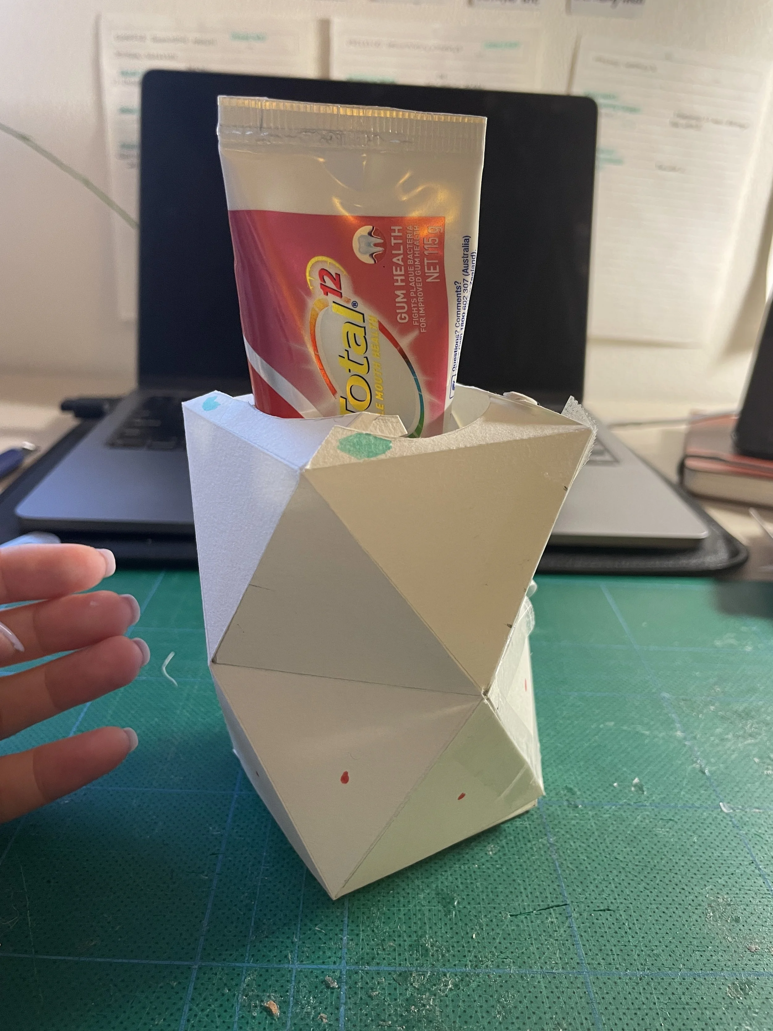
This design process deeply considers the single-use tendencies of current packaging design, and seeks to make it re-usable as a toothbrush stand or collapsible to be easily recycled.
Ritual + Repair
Repair: Honey
A spoonful of honey, contains a mix of sugar, amino acids, vitamins, minerals, iron, and antioxidants. It’s used both as a natural sweetener as well as an anti-inflammatory and anti-bacterial agent.
Ritual: Toothpaste
Honey is a comforting medium of repair, its used traced back 8000 years ago. Toothpaste is used ritually, with Propolis (a substance derived from honey), finding its way into the ingredients of this equally as ancient, cleaning product.
Exisiting packaging for the transportation of honey and toothpaste is busy (with over-stimulating visual content), wasteful (being thrown out straight after opening).
Initial Prototyping
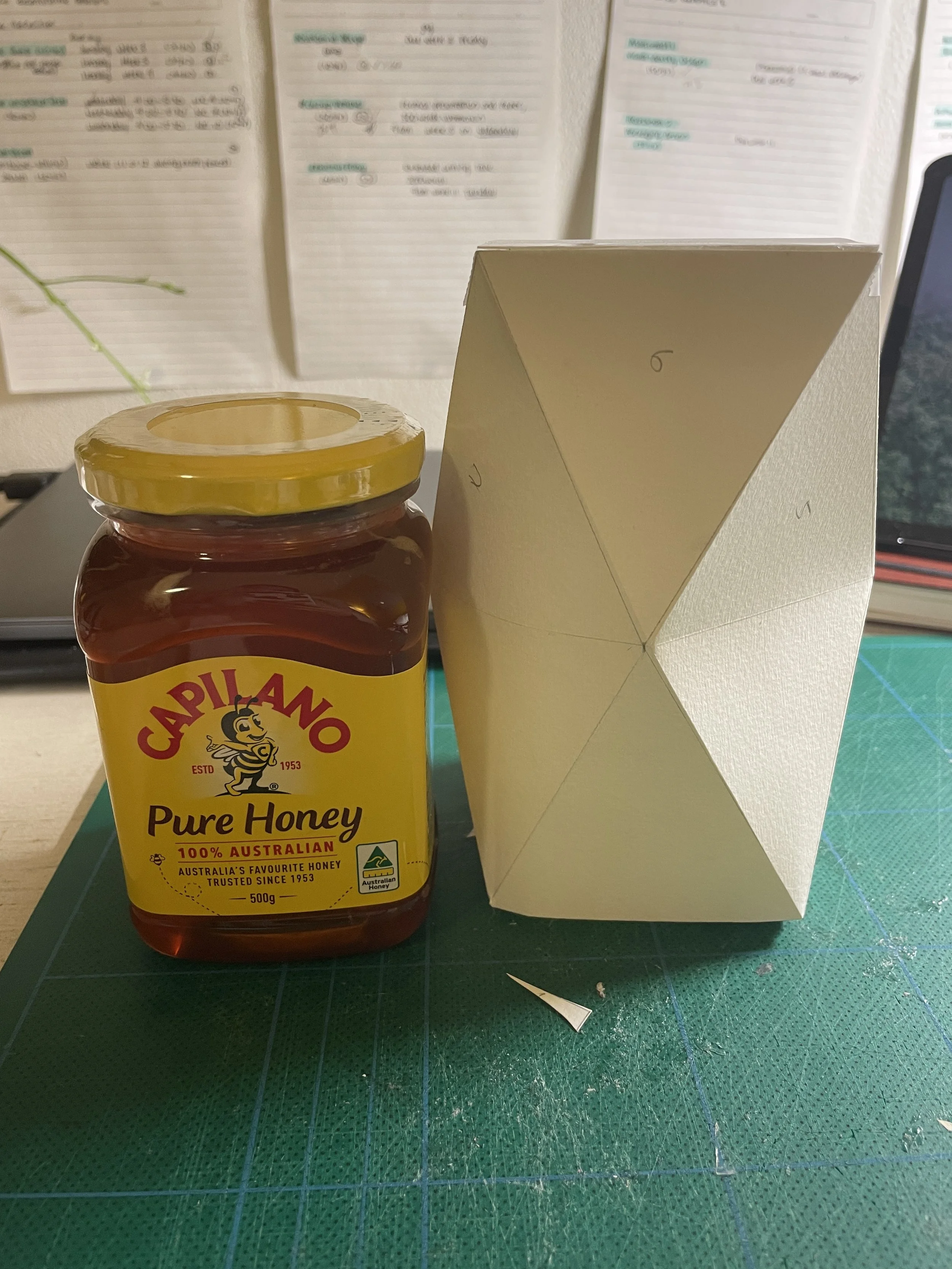
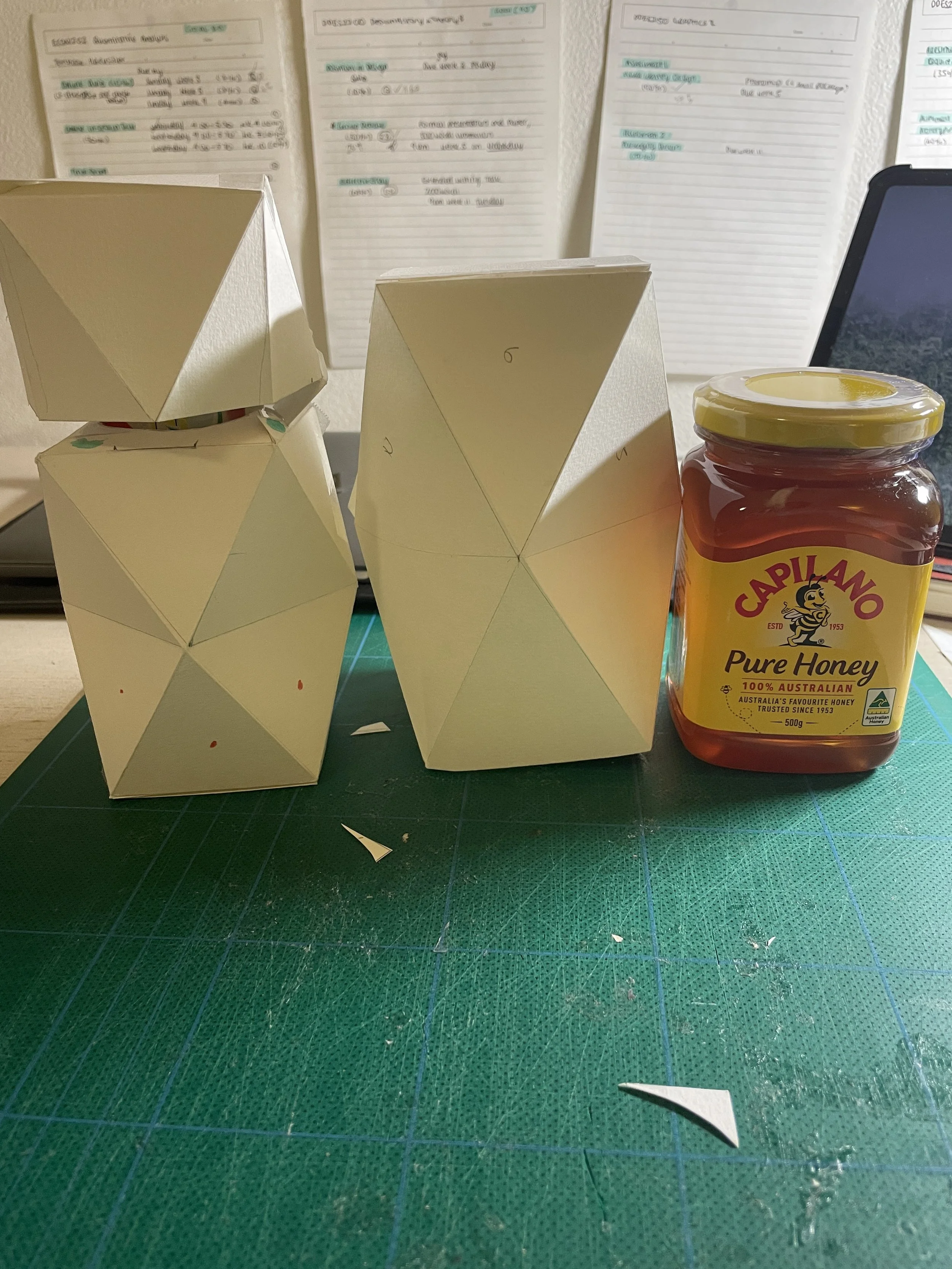
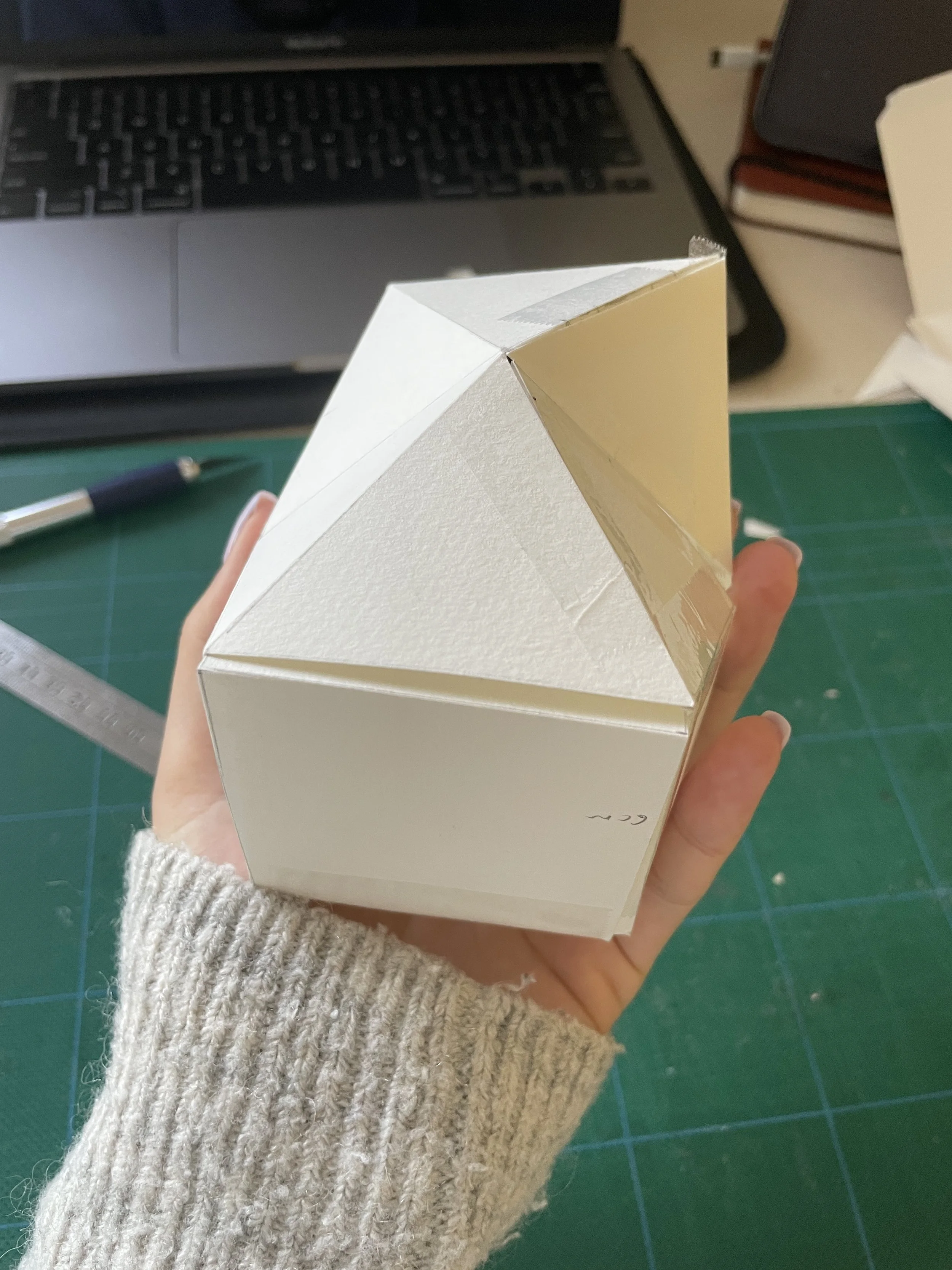
In the initial prototyping stage, I created a physical mockup of my proposed idea, and attached/cut away pieces of the prototype to suit the shape of the toothpaste and honey.
Net Design
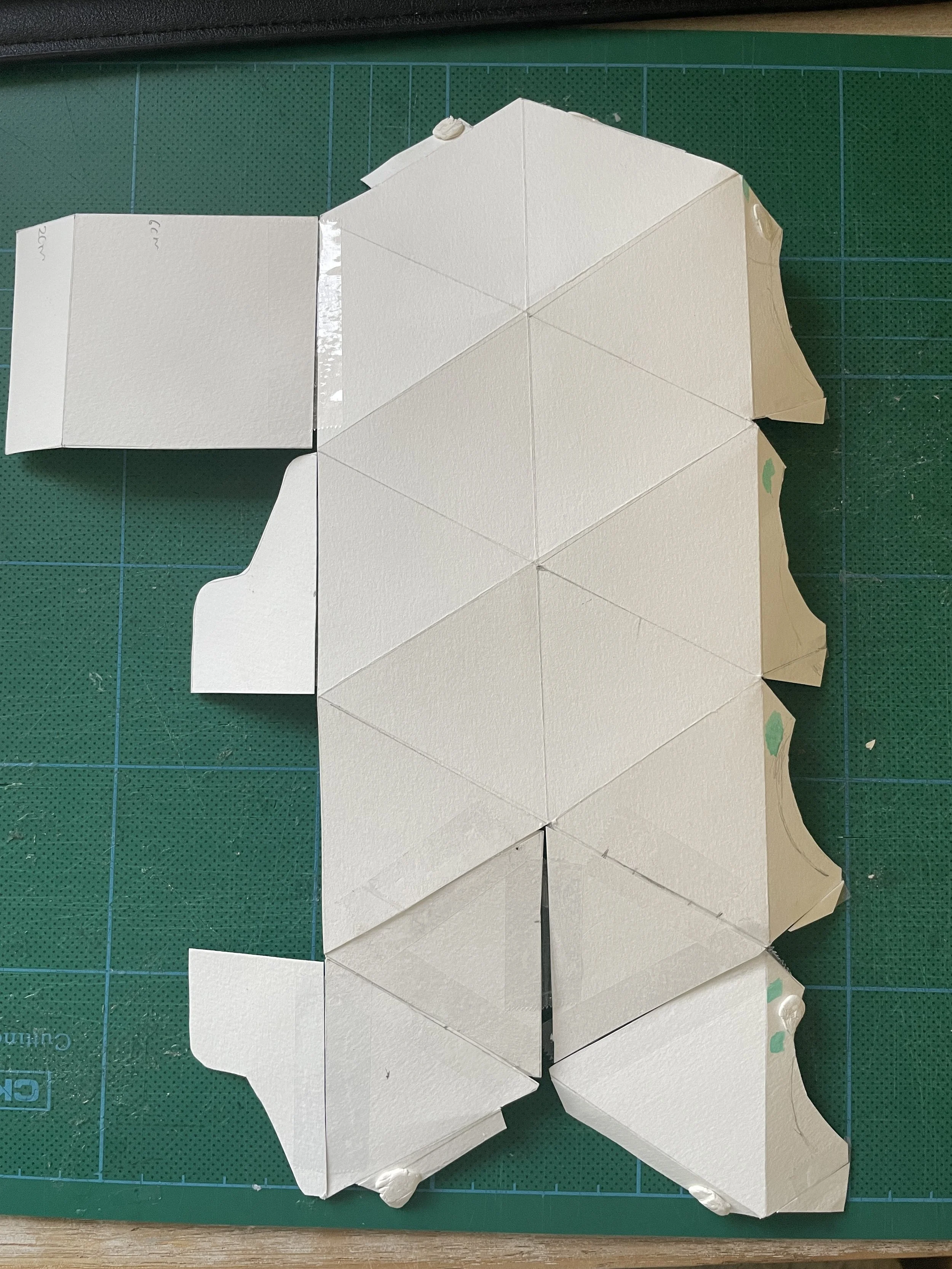
After prototyping some designs, I began creating a mockup of the net by tracing the original pattern. This process required several rounds of iterations and involved tweaking fold lines and cuts to ensure that the final outcome could be re-produced without error.
The final design required 3 nets - 2 for the toothpaste due to it’s height (with the bottom section able to be re-used as a toothbrush stand). 1 net required for the honey which was collapsable and could additionally be re-used for other kitchen gadgets.
Final Mockups
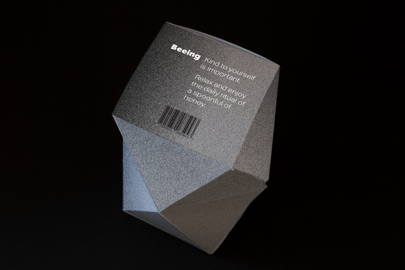
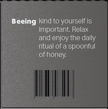
I developed a brand identity and font style to use on the new packaging design. I specifically picked colours that used minimal inks to remain environmentally sustainable. These colours can be produced with only black ink, and create a sense of serenity.
Final Prototype
After developing the net designs, I used them on 216 gsm FSC Mix Paper, which was a responsibly sourced white linenbond board blend with a subtle texture. The texture contrasts nicely with the faceted tactile faces of the package and the grainy style of the graphic language.
In production, the package of the cardboard would not need to be a specific colour, and would be a mixture of tans, whites and greys because of the nature of recycled paper.


