Emergency NSW Product Design
UX Design | Brand Identity | Research

Saving lives by connecting communities in times of emergency.
In early 2022, eastern QLD and NSW was inundated by torrential rain. It became one of the country’s worst recorded natural disasters. With telecommunication issues and patchy mobile internet coverage, it was near impossible for many residents to get help.
Emergency NSW grapples with how we can improve the way we deal with increasing cases of extreme weather and natural disasters.
Phrase 1: Scoping the Brief & Research
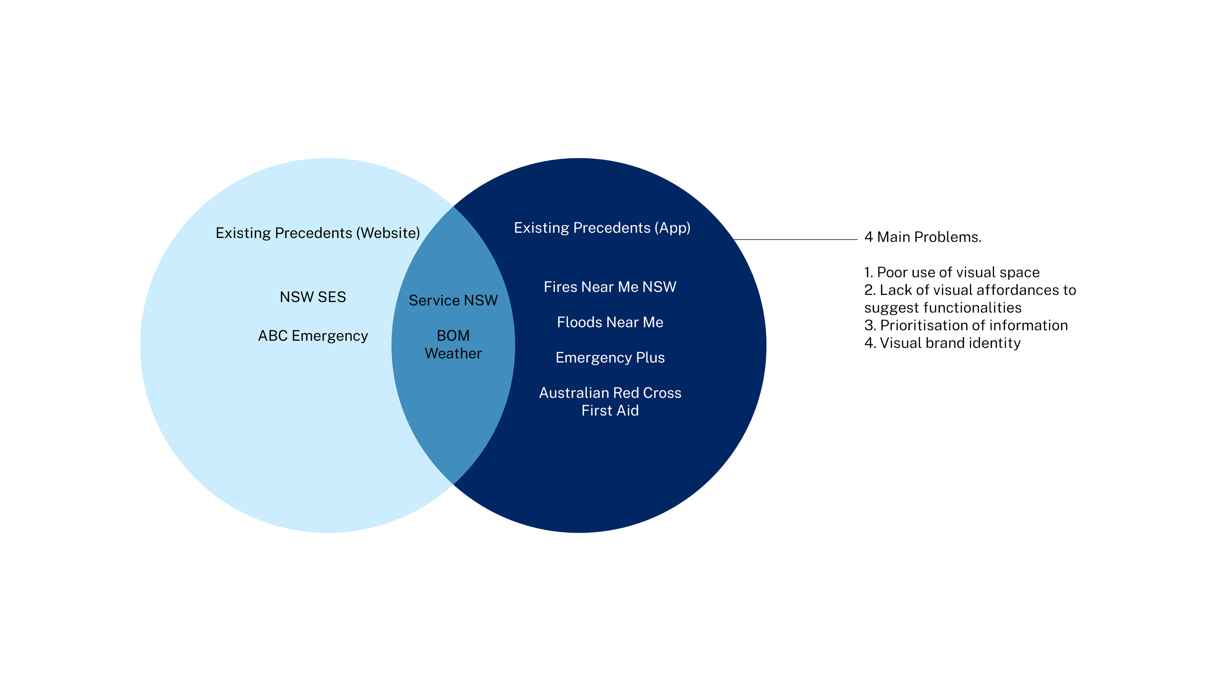
I began this project by scoping the brief and researching this problem. In my research report, I found that flood victims often need to visit multiple websites and apps to find information, which makes decision making time consuming. In my report I conducted design analysis on precedents (using frameworks such as Nielsen’s Heuristics, Think-Aloud Method, Global W3C Standards), developed user personas & user journeys and received stakeholder feedback from a Principal Designer at ServiceNSW.
I then developed this problem statement that helped guide my design:
“As a NSW resident living in a transitioning global climate, I want to be able to find information quickly in the event of severe weather or natural disaster. I also want to be able to help my community when I can, and also get assistance when I need”.


Phrase 2: Brand Identity
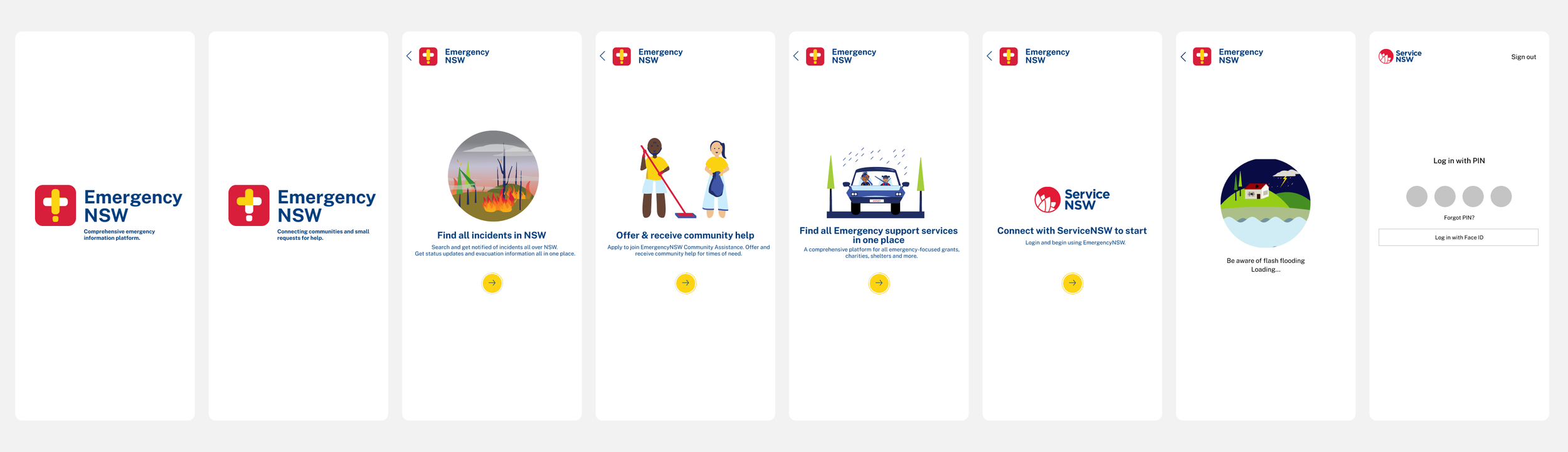
As part of this project, I developed a brand identity for the Emergency NSW app extension that followed the guidelines of Service NSW. I chose to add a new colour #EmergencyYellow that helps differentiate other services within the app.
Graphics were developed in an inclusive easy-to-reproduce cartoon style. The thinking behind this, was that the graphics should be able to be understood by everyone - even young children. The graphics should exude positivity and calmness, which is essential for young children who may be experiencing a natural disaster for the first time.
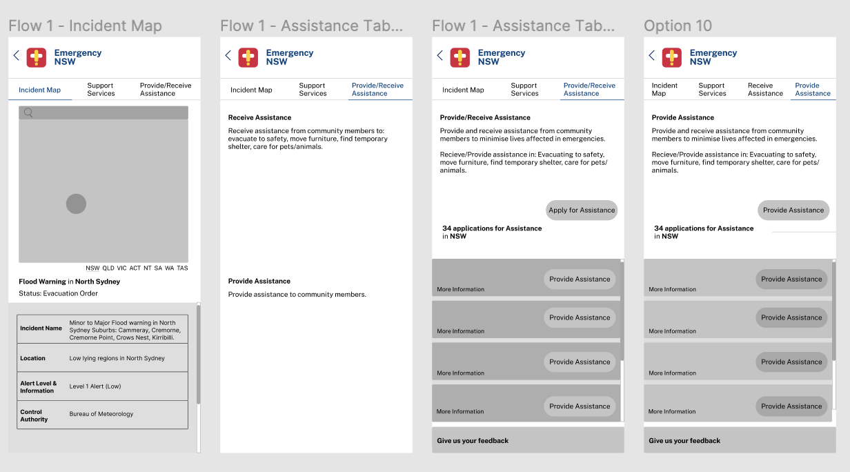
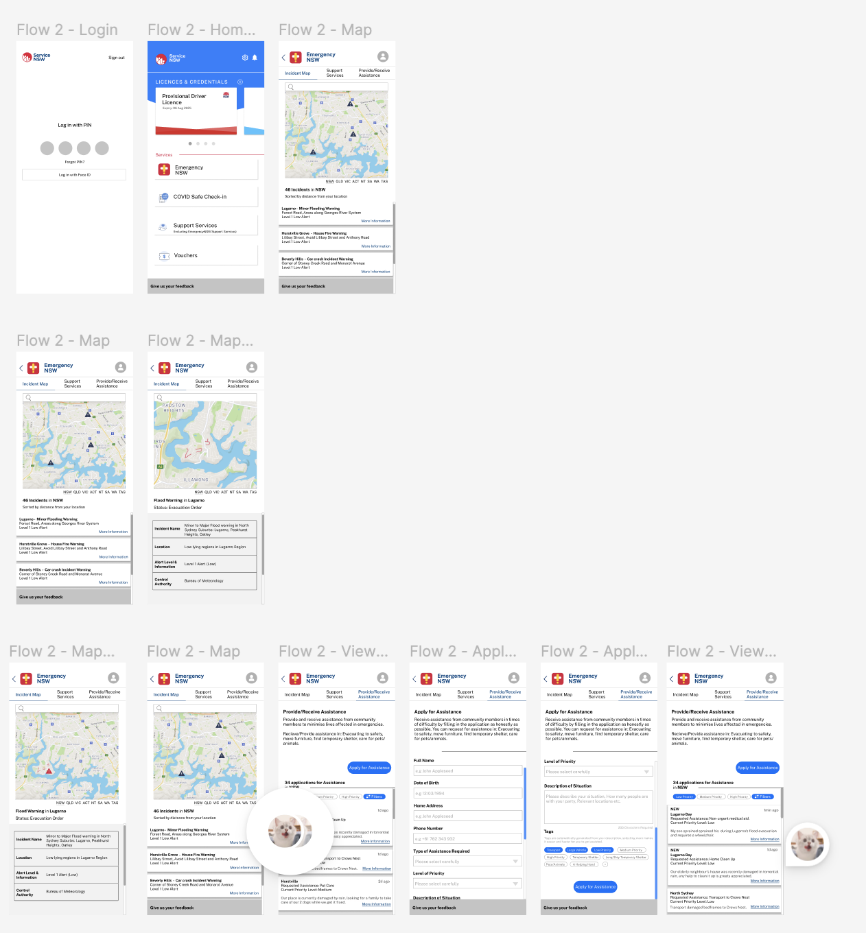
Phrase 3: Low Fidelity Wireframing
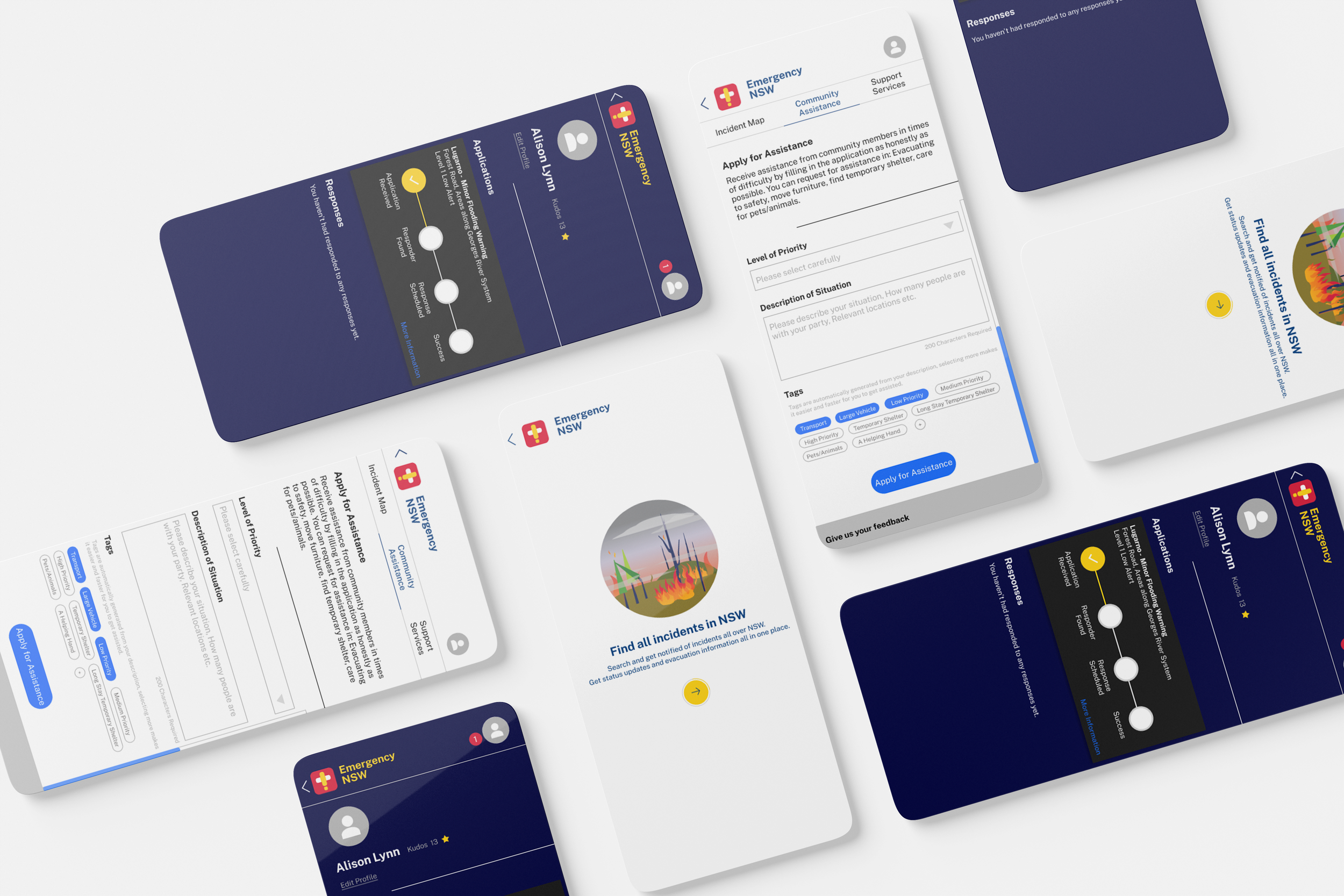
After validating my concept & developing a brand identity, I began brainstorming wireframes and conducting informal user testing with my friends and family. Their feedback helped me iterate on my designs and bring forth new ideas (e.g a tagging system).
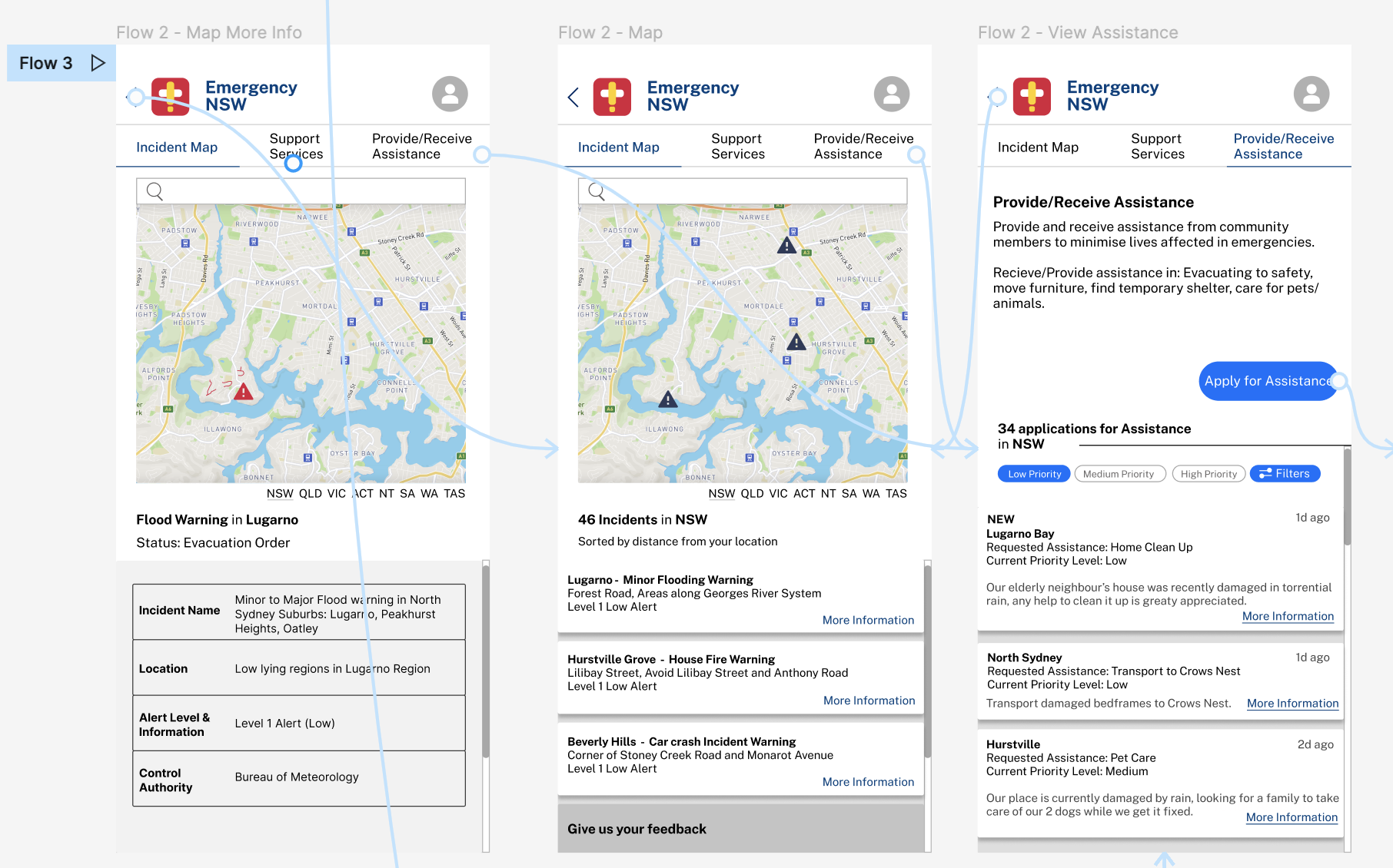
Phrase 4: Medium Fidelity Prototype, Graphic Animations & User Testing
Phrase 4 include developing a medium fidelity prototype and recording a walkthrough of the application.
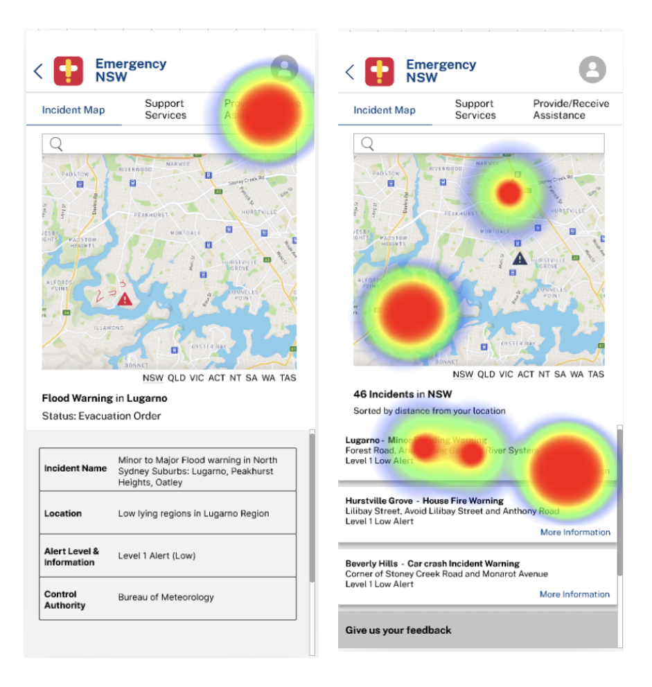
From my User Testing, I learned a few important things.
Users had different routes to find information, sometimes not the fastest route.
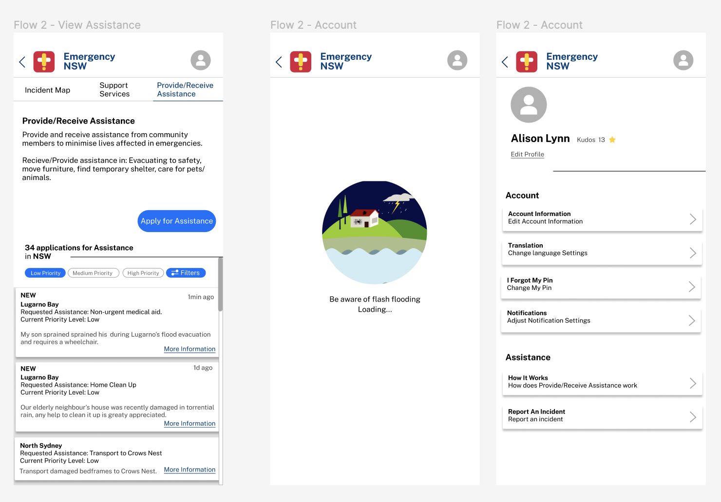
“Provide/Receive Assistance” was a vague term, and should be prioritised over “Support Services”.
Users found it required too many clicks to find information about assistance requests.
30% of my users said they would prefer to use a dark theme.
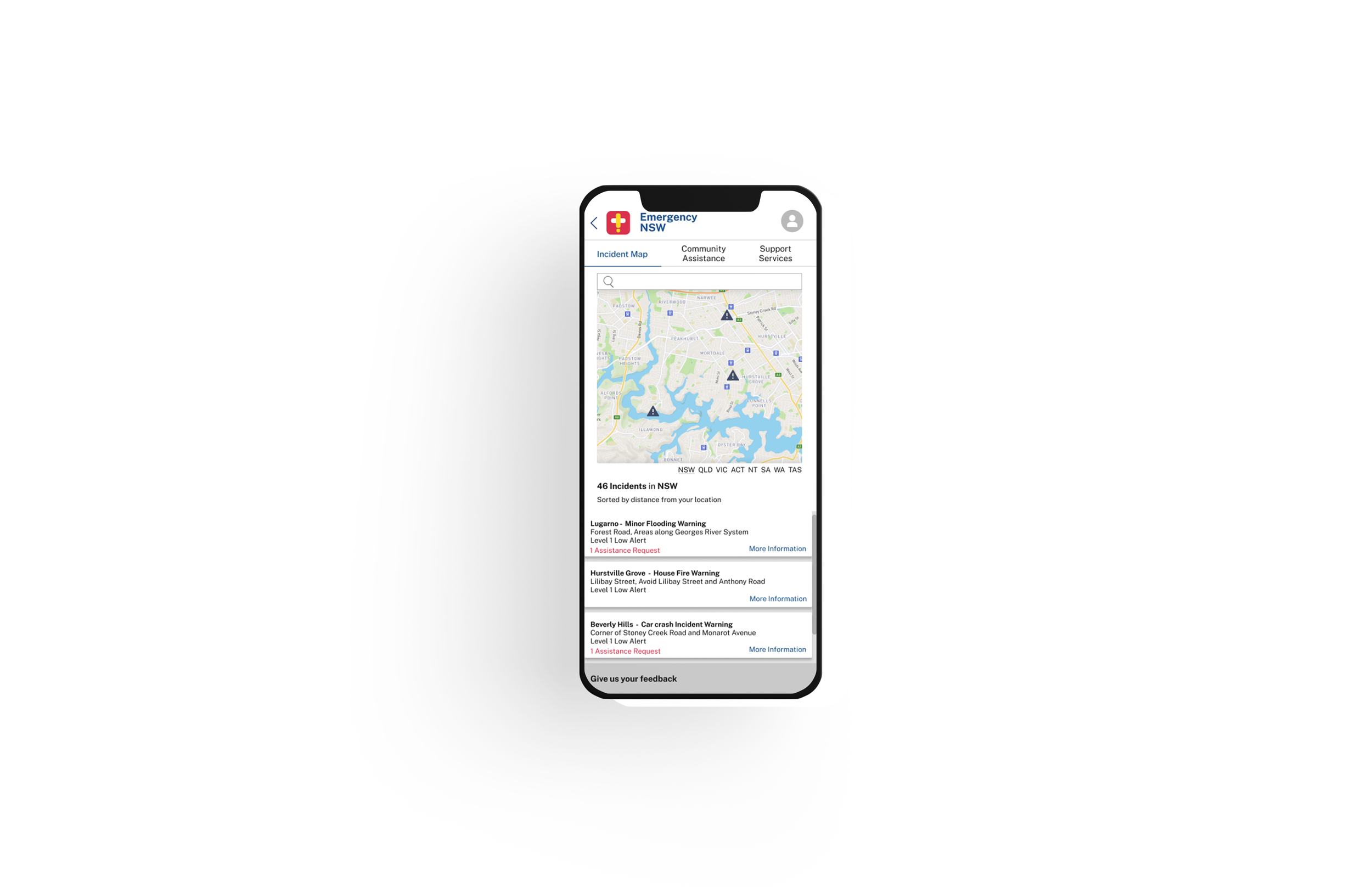
Phrase 5: High Fidelity Prototype & Reflection
Stage 5 of this project involved developing a high fidelity prototype and continuing user testing to tweak the app. This project was incredibly rewarding and the process involved designing through ambiguity. It pushed me outside my comfort zone in designing for a target audience similar to myself - and I was confronted with improving my designs to make information more accessible.
Some changes that I made include:
Reworking the user flow (similar to an Event-Driven Process Chain Model)
Tutorial Screen
Addition of assistance request notification in Incident Map Tab
Change “Provide/Receive Assistance” to “Community Assistance” and prioritised this tab.


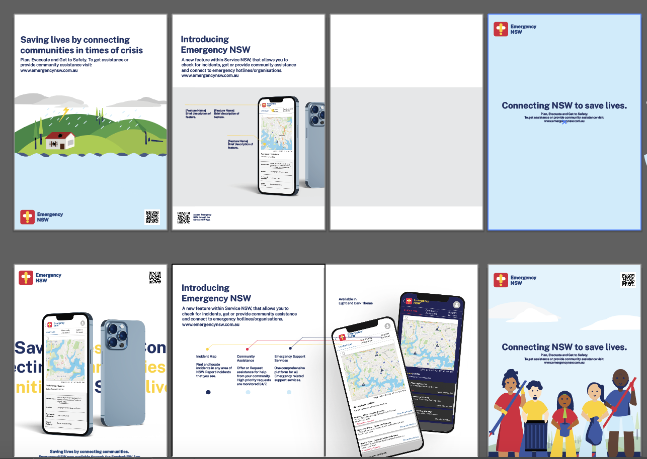
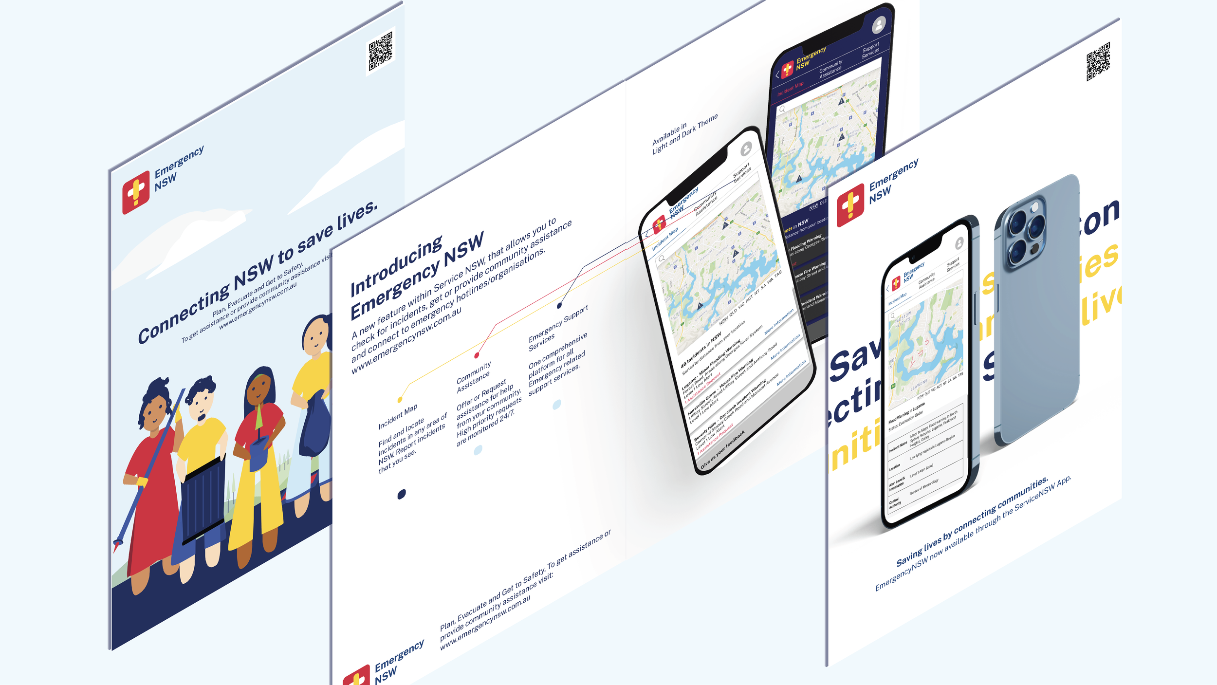
Phrase 6: Final Mockups and Marketing Pamphlet Design
Finally, I created mockups and a marketing pamphlet design (Room Sheet) which would hypothetically be used to market the design to the public.